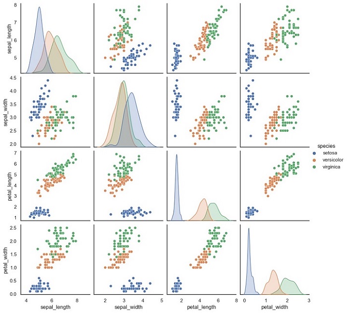
Scatter Matrix Plot is a graphical representation of the relationship between multiple variables. It is a useful tool in machine learning for visualizing the correlation between features in a dataset. This plot is also known as a Pair Plot, and it is used to identify the correlation between two or more variables in a dataset.
A Scatter Matrix Plot displays the scatter plot of each pair of features in a dataset. Each scatter plot represents the relationship between two variables. It is also possible to add a diagonal line to the plot that shows the distribution of each variable.
Python Implementation of Scatter Matrix Plot
Here, we will implement the Scatter Matrix Plot in Python. For our example given below, we will be using Sklearn”s Iris dataset.
The Iris dataset is a classic dataset in machine learning. It contains four features: Sepal Length, Sepal Width, Petal Length, and Petal Width. The dataset has 150 samples, and each sample is labeled as one of three species: Setosa, Versicolor, or Virginica.
We will use the Seaborn library to implement the Scatter Matrix Plot. Seaborn is a Python data visualization library that is built on top of the Matplotlib library.
Example
Below is the Python code to implement the Scatter Matrix Plot −
import seaborn as sns
import pandas as pd

# load iris dataset
iris = sns.load_dataset(''iris'')

# create scatter matrix plot
sns.pairplot(iris, hue=''species'')

# show plot
plt.show()
In this code, we first import the necessary libraries, Seaborn and Pandas. Then, we load the Iris dataset using the sns.load_dataset() function. This function loads the Iris dataset from the Seaborn library.
Next, we create the Scatter Matrix Plot using the sns.pairplot() function. The hue parameter is used to specify the column in the dataset that should be used for color encoding. In this case, we use the species column to color the points according to the species of each sample.
Finally, we use the plt.show() function to display the plot.
Output
The output of this code will be a Scatter Matrix Plot that shows the scatter plots of each pair of features in the Iris dataset.

Notice that each scatter plot is color-coded according to the species of each sample.